

See Kanshi Live in Action
These screens show how Kanshi presents detection volume, site-level activity, classification outcomes, and reasoning that teams can review in real workflows.
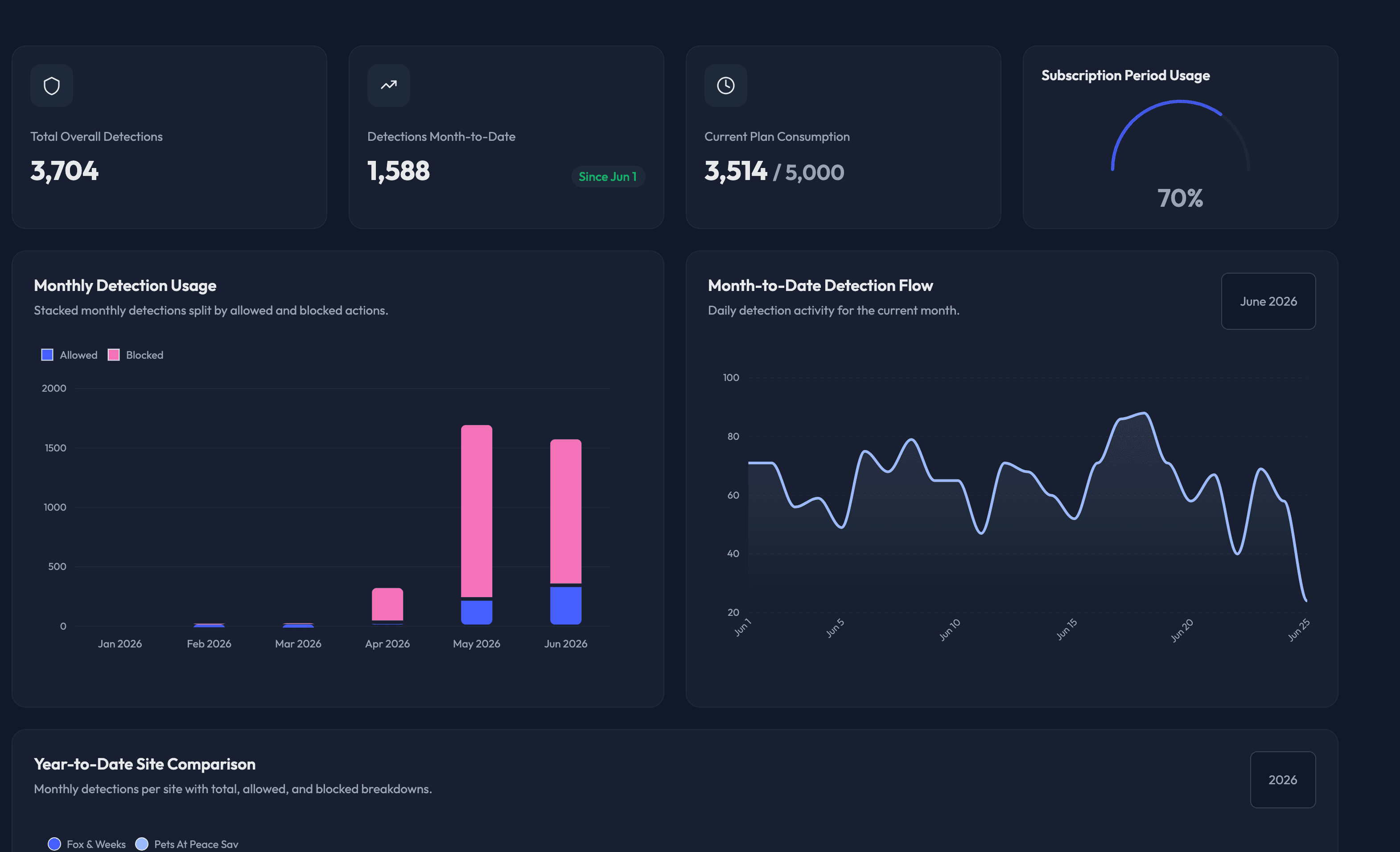
Overview dashboard
The overview screen shows total detections, current period usage, monthly flow, and protected-site comparisons so teams can understand volume and plan usage quickly.
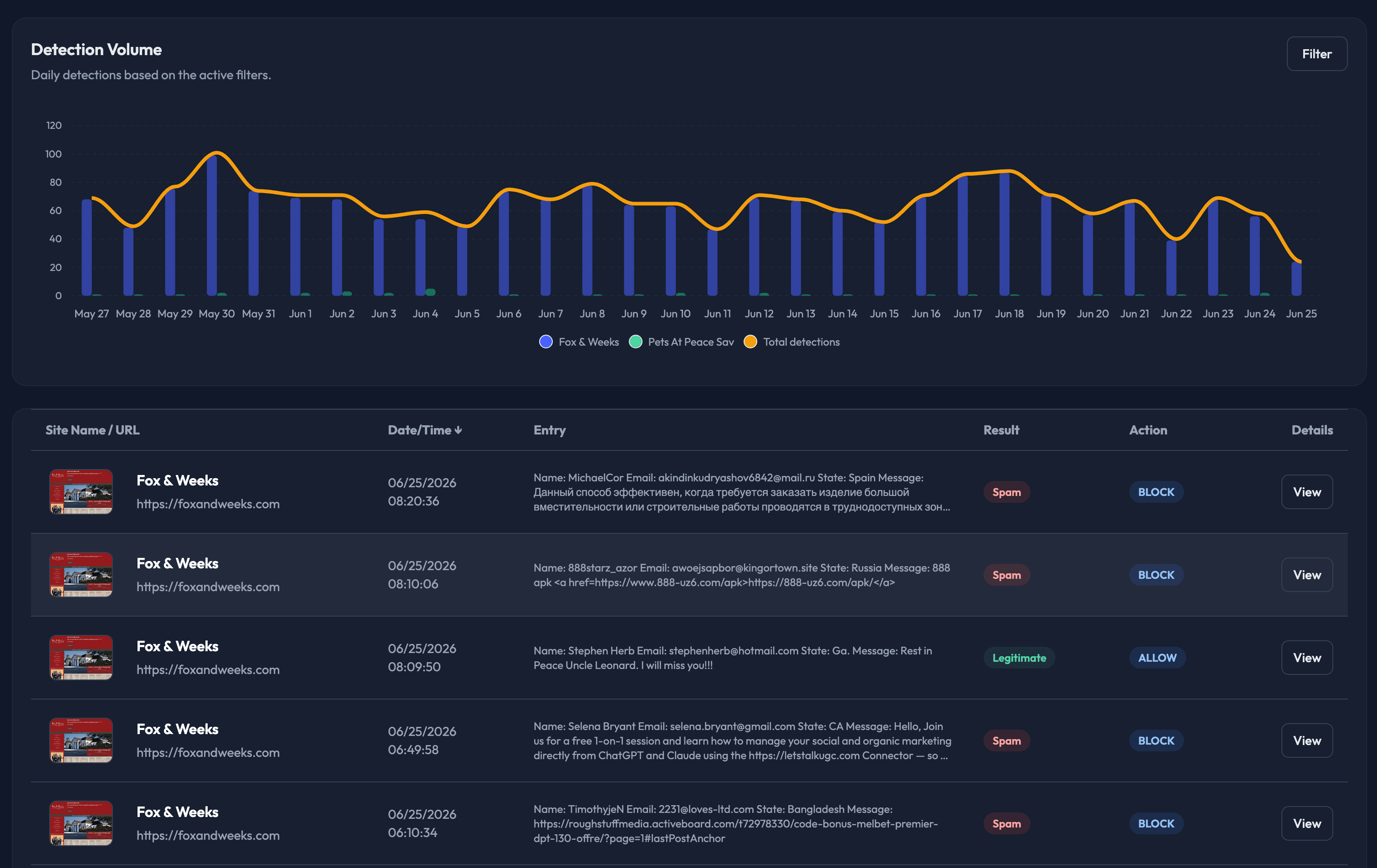
Live detections feed
The detections view shows day-by-day volume plus the actual submission records being processed, including site, timestamp, result, action, and message preview.
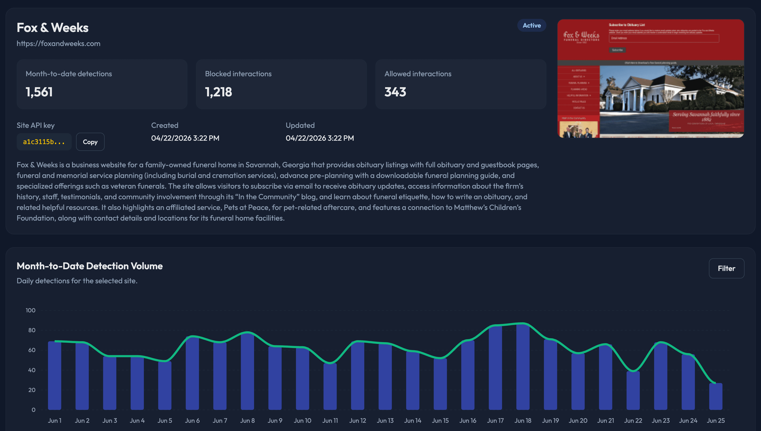
Site understanding and activity
Each protected site has its own profile showing month-to-date detections, blocked and allowed activity, key account details, a live site preview, and a written summary of what the site is actually for.
Reasoning and review details
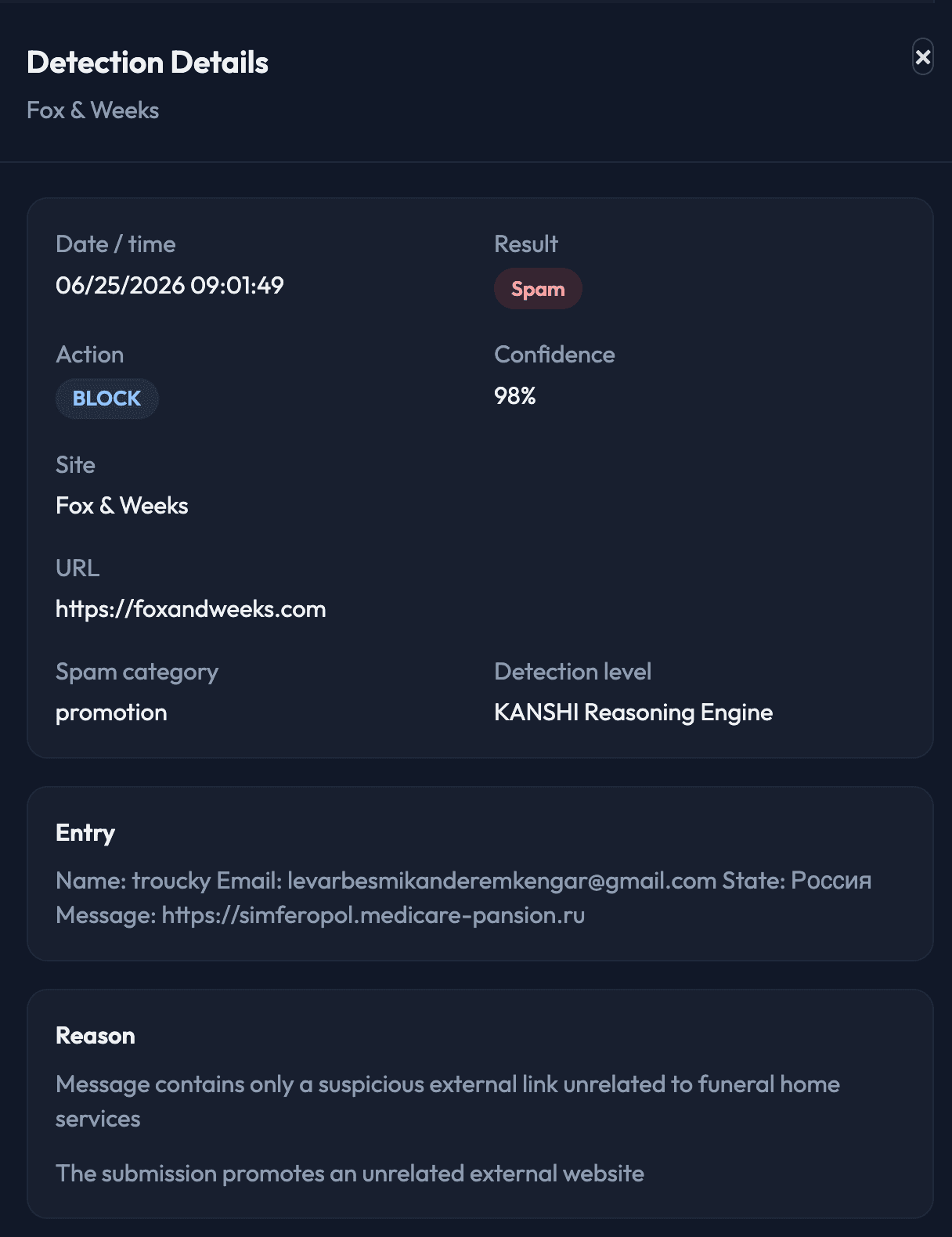
Each decision can be inspected in detail, including result, confidence, site context, entry content, and the reason behind the classification.
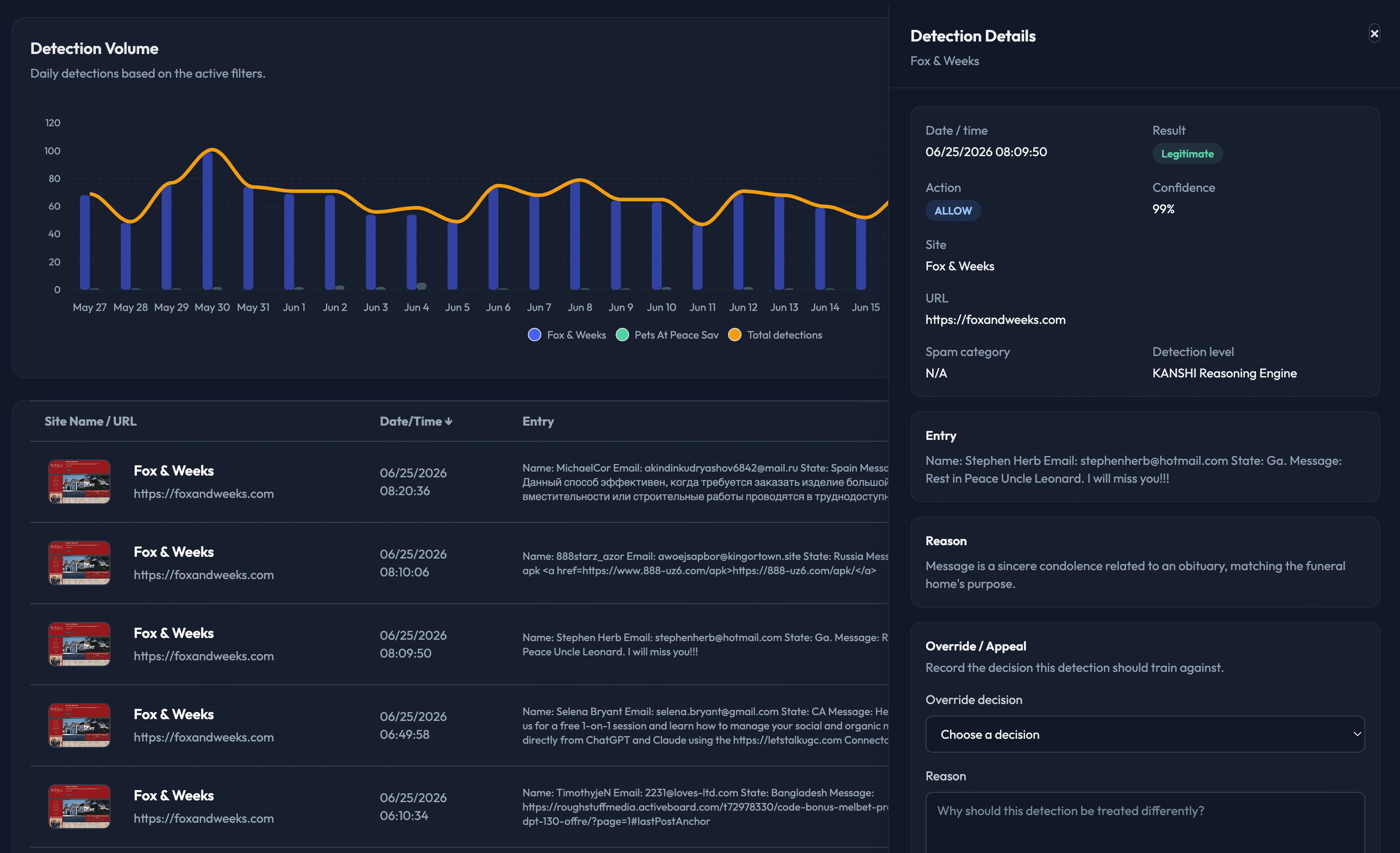
Single detection detail view
Teams can open an individual submission to see the exact timestamp, result, action taken, confidence score, spam category, submitted content, and the specific reasons Kanshi used to justify the decision.
See the dashboard on your own traffic
The value of Kanshi is easiest to understand when the dashboard is showing your real submissions, real spam, and real decisions.
Start your 10-day free trial